Working Within a Frame
Looking with one eye through a viewfinder instantly flattens the world into two dimensions of width and height. The third dimension, depth, is relegated to clues of occlusion (overlapping objects), aerial perspective, converging perspective lines, size changes, shading, focus blur, and elevation in the frame. Any depth we perceive to a photo is a product of one or more of these elements in the photo.
The Frame of Experience
Injecting a frame on a scene changes relationships of elements through elimination of space. Elements falling outside the frame have little to no contribution to meaning inside the frame. However, it's difficult to ignore past experience. A wonderful time of hiking and beach combing in Oregon may carry over when you pick up your camera to get a shot of the tide and rocks on the shore. You anticipate wonderful photos because you’re having a wonderful day. It’s difficult to isolate the objects in the viewfinder from the experience of the place. A better approach to shooting is to think of yourself as a newcomer to the scene or as someone showing this photo to a friend who has never been to Oregon before and doesn’t like the beach-could your photo convince them otherwise?
What Stays in and What Goes Out
The frame functions as a dispassionate observer treating fore, mid, and background with ambivalence. Some photo viewers will see your images in such a way.
Be more mindful of elements that encourage an engaged, active viewing. Make your photos more dynamic with vectors, curves, and subject placement using the golden section or rule of thirds. But, not all pictures need be dynamic to catch a viewer’s attention. Formal composition e can subtly extend a viewer's appreciation with the right subject matter. (Of course, it's up to you as the artist to decide what the right subject matter is.
Some elements are so visually attractive that the subject in the frame can be overshadowed. The frame of the photo is like a stage where the leading actor is supported by cast, crew, and scenery. The trouble comes when everyone fights for center-stage and the message gets lost. When shooting, avoid “actors” that are too gregarious, give too many details, or are overly endowed. They mean to steal the spotlight and it ruins the play.
The Power of the Edge

Like a magnet to steel, elements close to the frame’s edge create a visual tension that attracts the eye. Often, this attention is misdirected toward elements that have nothing to do with the intent of the photo. Offenders may include a head too near the top of the frame, a building’s edge running parallel with the frame, or a shape or line within the frame’s proximity. Minimize these effects by cropping out the offending elements in-camera or in post. (Find a handy cropping chart here.)
Sometimes, you can alleviate visual interference by adding a white (or dark) frame around a picture in image editing software (Lightroom, Photoshop, Instagram) whether the picture is in your hand or on a monitor. This frame helps show where your picture ends and the real world begins. As obvious as this seems, this seemingly insignificant frame reduces the time spent thinking about things outside the picture frame.
Multiple Frames
At times it’s not possible to tell a story within a single frame. One frame cannot contain the complete story. Sequential events, a change of seasons, a harmony of elements, or the succession of time can be better told through multiple frames.
Diptych and triptych sets of images are great ways to express a narrative using contrast, harmony or continuation. We don't need to stop there. Sometimes a slideshow of images can tell what it was like to be there better than even a diptych/triptych. Lightroom, Soundslidese, Photostagee, or other apps offer a variety of ways to tell your photo story.
Aspect ratios (rectangles and squares)
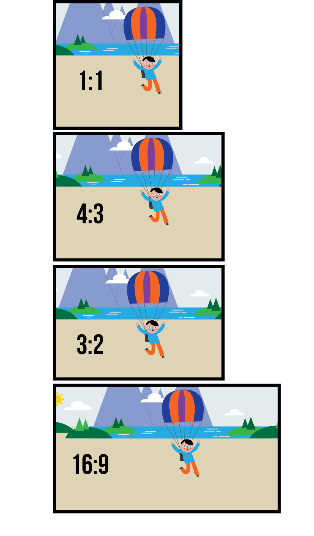
The relationship of the frame’s width to height is a ratio denoted with a colon.

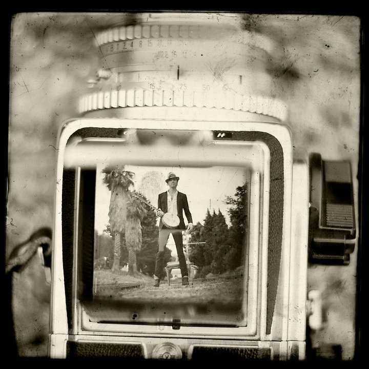
A wide screen TV has a 16:9 (also called 1.78:1) aspect ratio, where a full frame DSLR is 3:2. Old school film cameras like Hasselblads and twin lens reflexes are square with a 1:1 ratio (along with all of your Instagrams). Technically, the category of panoramic cameras used for landscape and some architectural photography is determined by a 2:1 or greater aspect ratio.
Aspects ratios have long dictated the shape of photographic prints and movie theater screens. Editing software now makes the constrained aspect ratio of the image less dogmatic (?). Magazines, newspapers and book publishers have always known that a photo can be cropped to the space available, regardless the aspect ratio. Visually savvy photographers understand that the photographic frame should hold only those elements vital to the message of the photo.
- Get it? It's a dog mat. Ha!
Vertical versus Horizontal
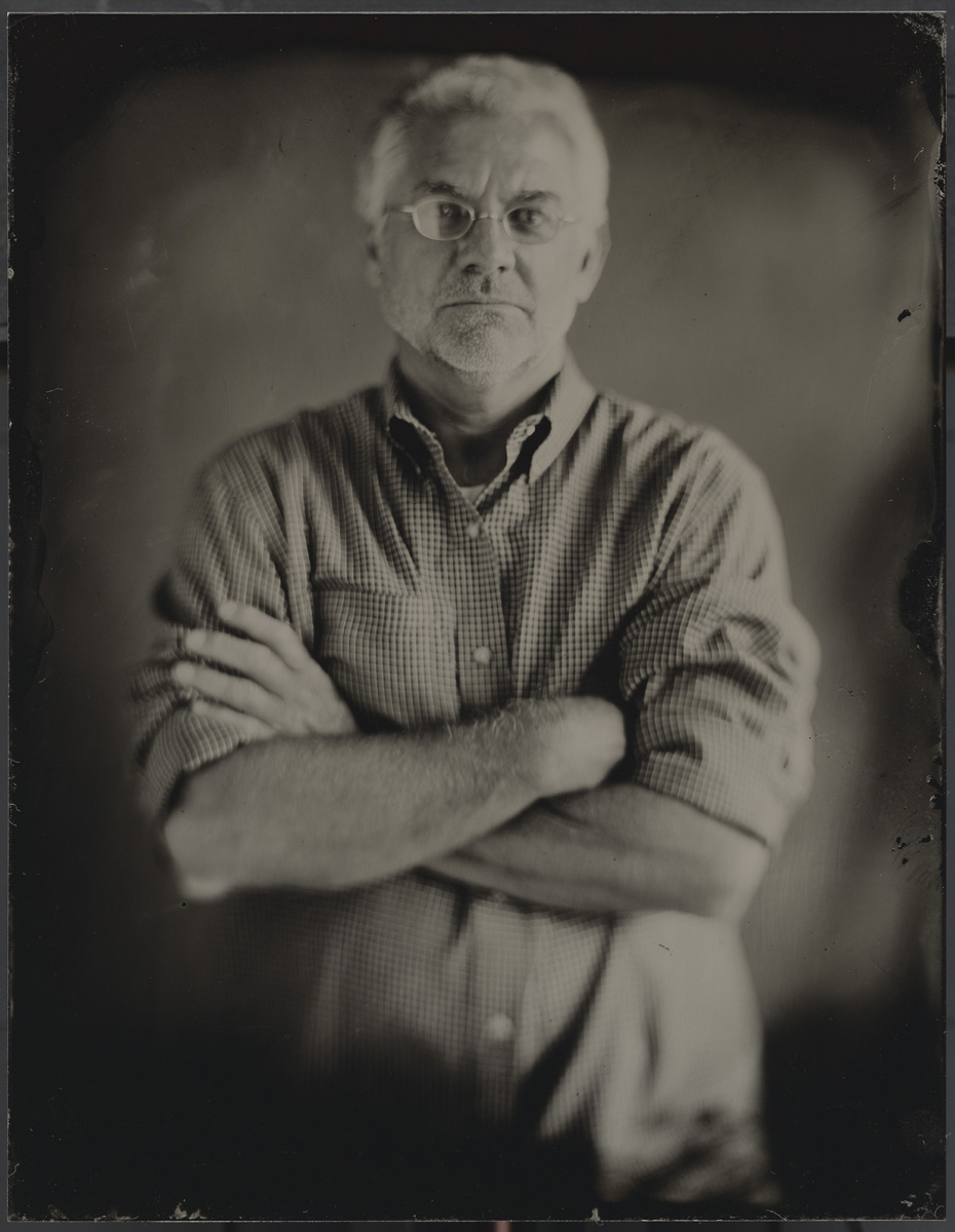
Some photographers suffer from a debilitating disease known as horizontalism. Turning their camera vertically causes violent convulsions and blurry pictures. But, some scenes deserve a vertical format.
How are you suppose to know? The principles of harmony and contrast should guide your decision. Harmony is created when the prominent direction of the subject is matched by the direction of the frame. This repetition of direction results in an emphasis of meaning for the viewer.
Contrast of frame direction and image direction creates a visual tension that is often dynamic and aggressive. Creating tension by placing image content in opposition to the frame is a risk, but it’s one worth taking.
Building and using a viewing frame
viewing frame construct from Roger Tuttle on Vimeo.
Understanding how the frame works in photography is no simple thing. Putting the camera to your eye isn't going to guarantee this understanding. Enter the viewing frame.
One of the best ways to learn to see "photographically" is to make an actual frame, go out, then put it up to your face and look through it. You might be surprised with your new view on the world. Above is an instructional video to show how to make your own frame from matte board, below shows how to use it.
frame use from Roger Tuttle on Vimeo.
For the better part of three decades, Roger Tuttle has photographed life, for pay and for passion. Along with his varied photo projects, Roger splits time teaching Photography at the University of Utah and Utah Valley University.
His primary shooter is a Vivitar 600 (not really).


